File Info
Quickstart guide

Installation/Update
Installation/Update
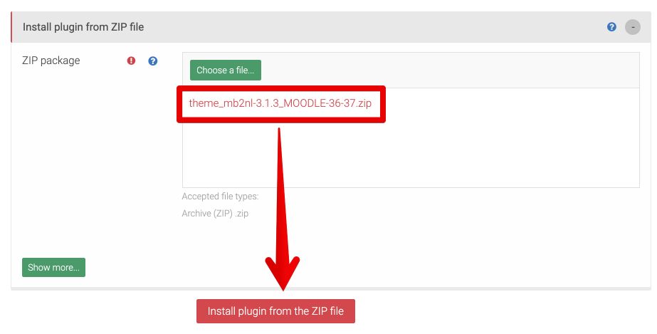
Go to: Site administration → Plugins → Install Plugins and choose theme file for specific Moodle version:
- theme_mb2nl-x.x.x_MOODLE-27-35.zip - for Moodle 2.7 - 3.5
- theme_mb2nl-x.x.x_MOODLE-36.zip - for Moodle 3.6
- theme_mb2nl-x.x.x_MOODLE-37.zip - for Moodle 3.7
- theme_mb2nl-x.x.x_MOODLE-38-39.zip - for Moodle 3.8 - 3.9
If you don't know what vesrion of Moodle you are using check Moodle documentation.
After that click "Install plugin from the ZIP file" button.
During the next steps you must to confirm installation and upgrade Moodle database.
For more info check Moodle documentation.
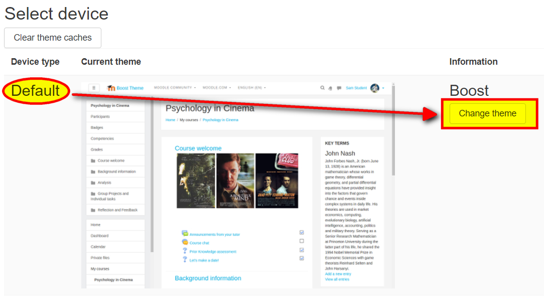
Activation Theme
After installation go to: Site administration → Appearance → Themes → Theme selector and click "Change theme" button at "Default" device type.
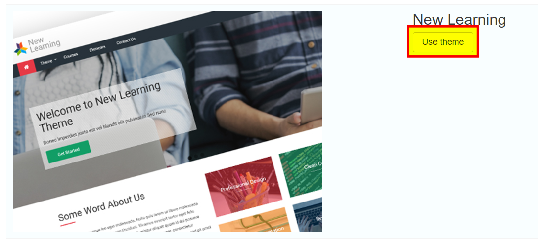
Then find "New Learning" theme and click "Use theme" button.
For more info check Moodle documentation.
Settings
Settings Access
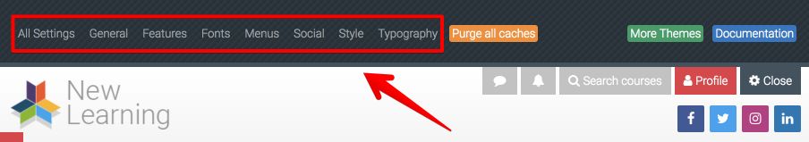
To access the theme options click "Theme settings" link on top right or go to: Site administration → Appearance → Themes → New Learning.

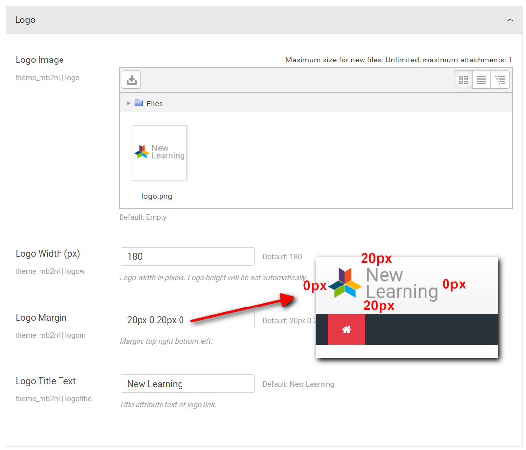
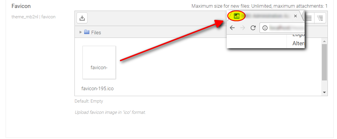
Logo and Favicon
Location: Theme settings → General → Logo and Favicon.
You may upload custom logo image moodle file picker. After uploading you can set logo width (height will be set automatically), margin (top, right, bottom left) and logo "title" attribute text.
Below logo settings you may upload favicon image in "ico" format.
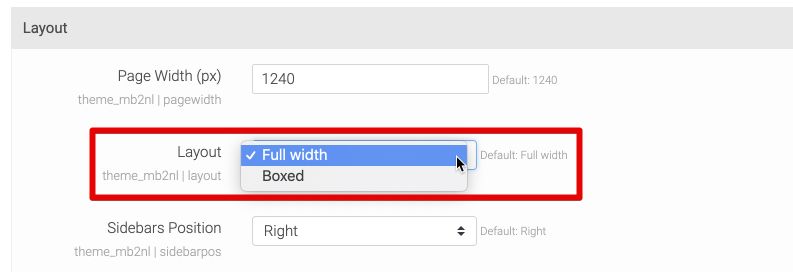
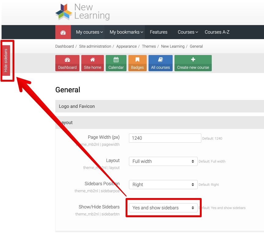
Layout
Location: Theme settings → General → Layout.
You may select "Full width" or "Boxed" layout of the theme. For each layout you can set custom page width (maximum width) in pixels.
Layout "Full width" is a default layout in which whole page has white background color without image background.
"Boxed" layout is a layout in which page content is placed in a narrower container. In this case you may set custom page image or/and background color.
In layout settings section you may set also sidebars position (left, right or classic) and show/hide sidebars button.
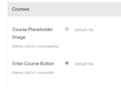
Courses
Location: Theme settings → General → Courses.
In this options area you may enable courses placeholder image (it will be display if you don't add any mage to "Course summary files" form field) and course "enter" button.
You may set also course banner image.
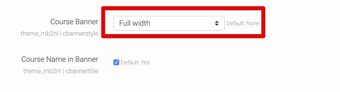
Then in course description settings add "Course image".
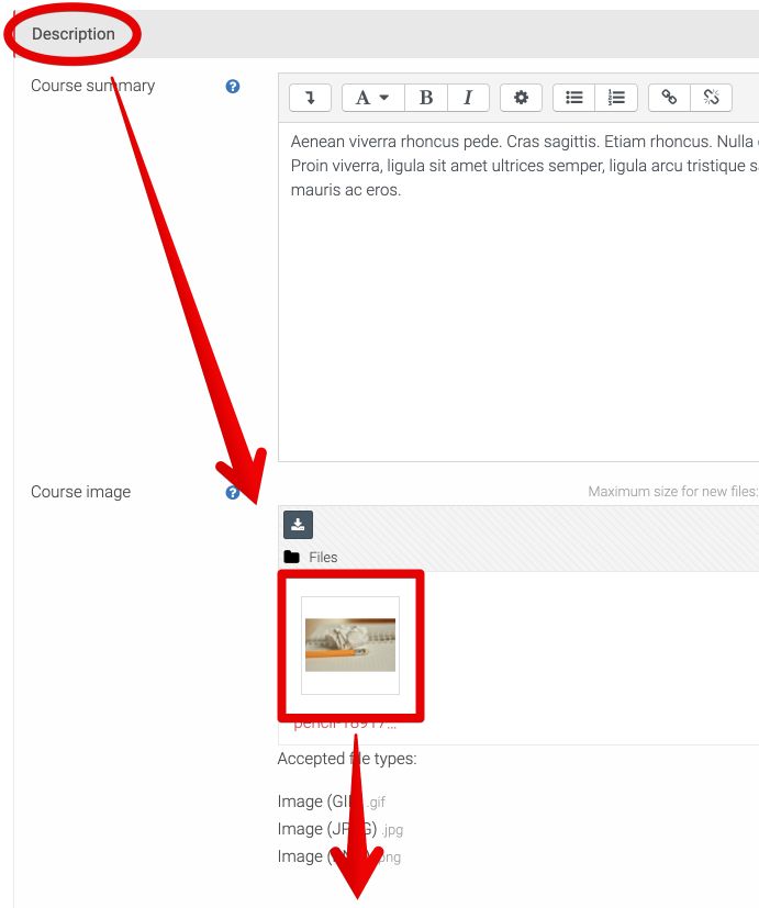
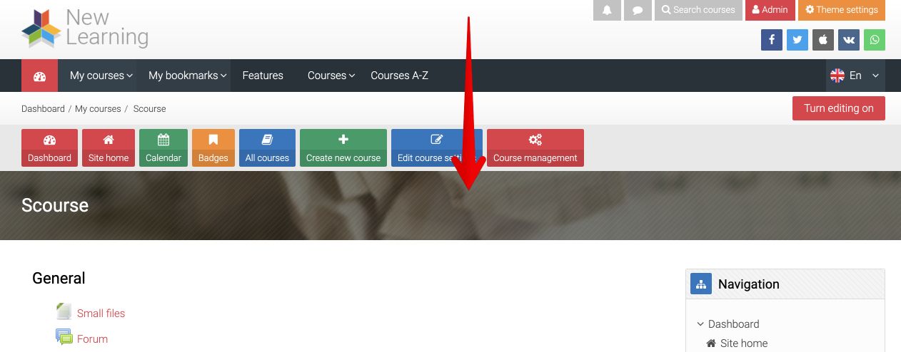
After that course image will be display as a banner on course pages.
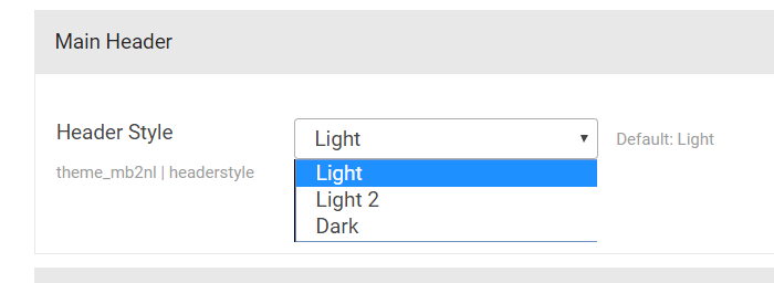
Main Header
Location: Theme settings → General → Header.
You may use one of three header styles:
- Light (default)
- Light 2
- Dark
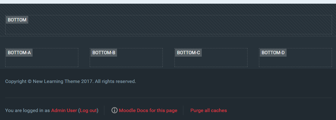
Block Regions
Location: Theme settings → General → Block Regions.
Theme provide the followind block regions:
- Slider (slider)
- After slider (after-slider)
- Before content (before-content)
- Side pre (side-pre)
- Side post (side-post)
- After content (after-content)
- Bottom (bottom)
- Bottom a, b, c, d (bottom-a, bottom-b, bottom-c, bottom-d)
In general settings you may add custom css class for region and then add some specific style for blocks placed in this region. To use custom class for some region write: "regionName:className". Classes for each regions write in a new line.
The following block classes are defined:
- "notitle" - with this class you can hideblock title.
For selected block regions (after slider, before content, after content) you may set custom style (background image and color) and also padding top and bottom. To do it go to: Theme settings → Style.
Footer
Location: Theme settings → General → Footer.
You may add custom footer content and show/hide login info in footer.
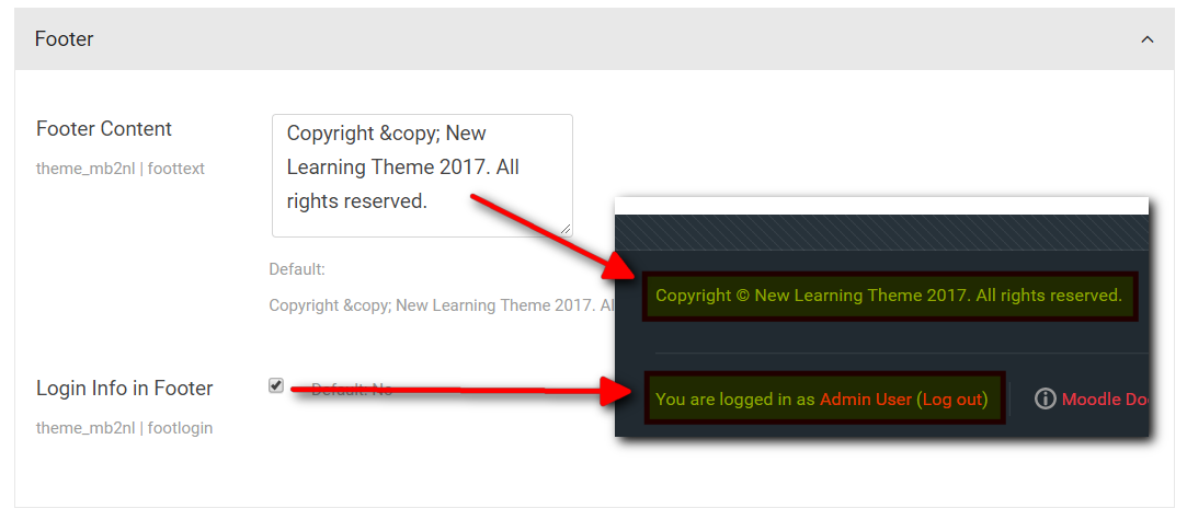
Above copyright info you may place Moodle blocks with custom content.
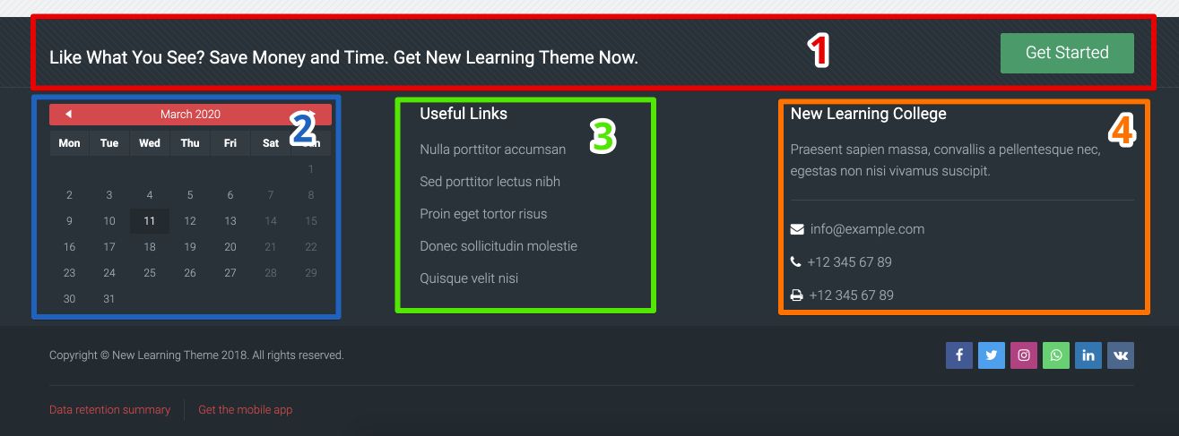
#1
This is block "HTML" published in "Bottom" block region. There is the following content in this block:
[columns]
[column size="8"]
[h size="4" margin="15px 0 0 0"]Like What You See? Save Money and Time. Get New Learning Theme Now.[/h]
[/column]
[column size="4" class="text-right"]
[button link="#" type="success" size="lg"]Get Started[/button]
[/column]
[/columns]
#2
This is "Calendar" block published in "Bottom-a" block region.
#3
This is block "HTML" published in "Bottom-b" block region. There is the following content in this block:
[list]
[list_item link="#"]Nulla porttitor accumsan[/list_item]
[list_item link="#"]Sed porttitor lectus nibh[/list_item]
[list_item link="#"]Proin eget tortor risus[/list_item]
[list_item link="#"]Donec sollicitudin molestie[/list_item]
[list_item link="#"]Quisque velit nisi[/list_item]
[/list]
#4
This is block "HTML" published in "Bottom-c" block region. There is the following content in this block:
Praesent sapien massa, convallis a pellentesque nec, egestas non nisi vivamus suscipit.
[line color="light" margin="20px 0"][/line]
[icon name="fa-envelope" nline="1" color="#fff" margin="0 0 13px 0"]  info@example.com[/icon]
[icon name="fa-phone" nline="1" color="#fff" margin="0 0 13px 0"]  +12 345 67 89[/icon]
[icon name="fa-print" nline="1" color="#fff"]  +12 345 67 89[/icon]
You may use publish block maximum in four columns.
Features
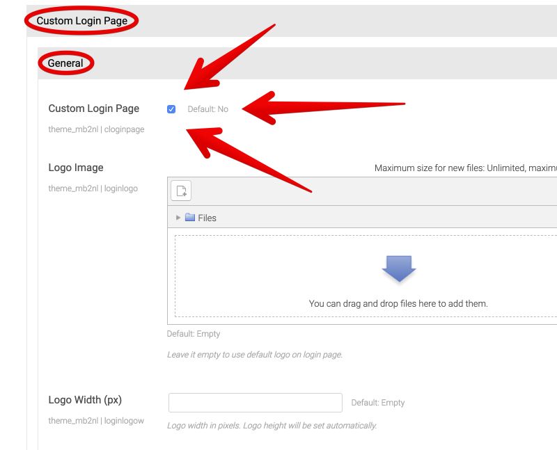
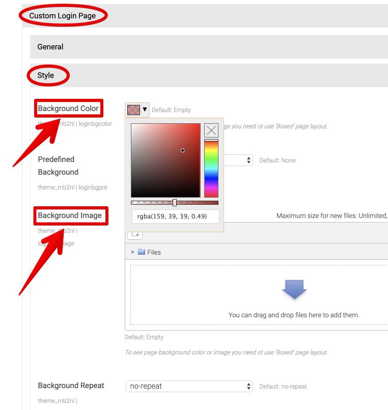
Custom Login Page
Location: Theme settings → Features → Custom Login Page.
You may set custom login page which is fully customized. You may set custom logo image and page background (color and image).
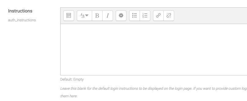
On login page you may add custom login instructions content ("Is this your first time here?").
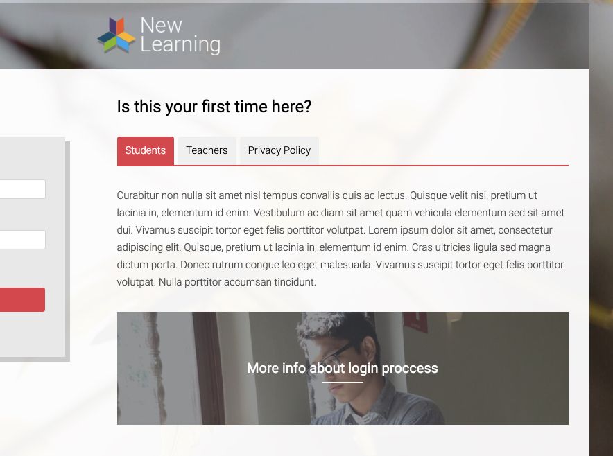
To setup login instructions go to Site administration → Plugins → Authentication → Manage authentication, and insert the following code into "Instructions" form field:
[tabs margin="0 0 30px 0"]
[tab_item title="Students"]Curabitur non nulla sit amet nisl tempus convallis quis ac lectus. Quisque velit nisi, pretium ut lacinia in, elementum id enim. Vestibulum ac diam sit amet quam vehicula elementum sed sit amet dui. Vivamus suscipit tortor eget felis porttitor volutpat. Lorem ipsum dolor sit amet, consectetur adipiscing elit. Quisque, pretium ut lacinia in, elementum id enim. Cras ultricies ligula sed magna dictum porta. Donec rutrum congue leo eget malesuada. Vivamus suscipit tortor eget felis porttitor volutpat. Nulla porttitor accumsan tincidunt. [/tab_item]
[tab_item title="Teachers"]Nulla porttitor accumsan tincidunt. Vestibulum ac diam sit amet quam vehicula elementum sed sit amet dui. Donec rutrum congue leo eget malesuada. Vestibulum ac diam sit amet quam vehicula elementum sed sit amet dui. Curabitur aliquet quam id dui posuere blandit. Curabitur aliquet quam id dui posuere blandit. Curabitur non nulla sit amet nisl tempus convallis quis ac lectus. Lorem ipsum dolor sit amet, consectetur adipiscing elit. Nulla porttitor accumsan tincidunt. Nulla porttitor accumsan tincidunt. [/tab_item]
[tab_item title="Privacy Policy"]Cras ultricies ligula sed magna dictum porta. Praesent sapien massa, convallis a pellentesque nec, egestas non nisi. Mauris blandit aliquet elit, eget tincidunt nibh pulvinar a. Curabitur aliquet quam id dui posuere blandit. Curabitur arcu erat, accumsan id imperdiet et, porttitor at sem. Curabitur arcu erat, accumsan id imperdiet et, porttitor at sem. Vivamus magna justo, lacinia eget consectetur sed, convallis at tellus. Lorem ipsum dolor sit amet, consectetur adipiscing elit. Curabitur non nulla sit amet nisl tempus convallis.[/tab_item]
[/tabs]
[boxes size="small"]
[boximg image="https://placeimg.com/800/200/nature" link="#" color="#48494c"]More info about login proccess[/boximg]
[/boxes]
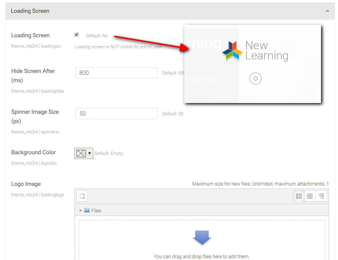
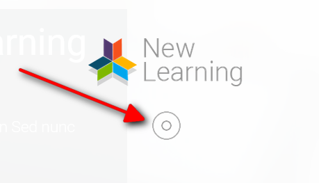
Loading Screen
You may enable nice screen with logo and animated spinner when page is loading. This page is fully customized, you may change spinner type, background color, add custom logo image and change the time after which loading screen is hidden.
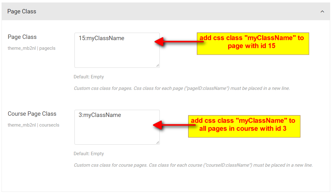
Page Css Classes
You may use custom css class for a specific page (Moodle page module) and then add custom css style for this page/pages. You may add different classes for different pages (in a new line) or add css class for all pages in course.
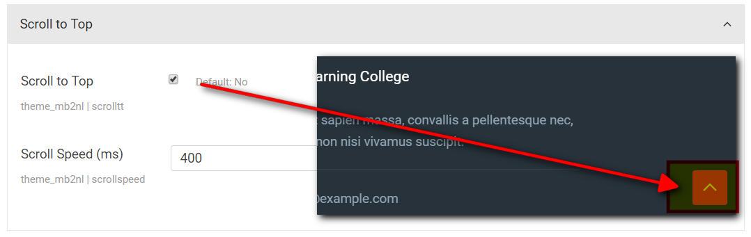
Scroll to Top
You may enabled scroll to top link with smooth animation effect.
Menu Settings
Main Menu
To setup menu go to: Site administration → Appearance → Themes → Theme settings and add menu items into "Custom menu items" form fields.
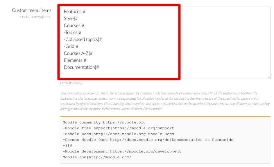
For more info check Moodle documentation.
Also in theme settings you may set many options of main menu. To do it go to: Theme settings → Menus → Main Menu.
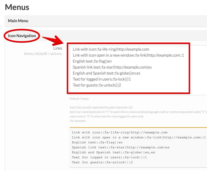
Icon Menu
Location: Theme settings → Menus → Icon Navigation.
In theme settings you may add menu items with custom icon and text.
Main Slider
Slider Installation
To use slider you need to install "Mb2 Slides" local plugin which is located in "Plugins" folder.
Go to Site administration → Plugins → Install Plugins, upload "local_mb2slides-x.x.x.zip" file and click "Install plugin from the ZIP file" button.
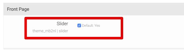
Slider Setup
To display slider on front page go to: Theme settings → General → Front Page and make sure that "Slider" option is enabled.
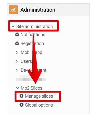
To add slides go to: Site administration → Mb2 Slides → Manage slides. Then click "Add slide" button.
The size of slider images on demo page is 1900 x 600 pixels. If you wan to increase height of slider just upload higher image, for example 1900 x 750 pixels.
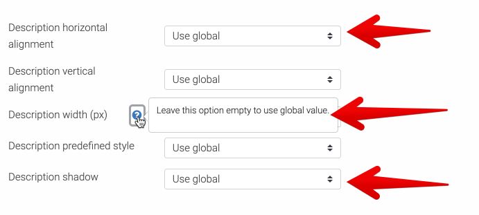
Mb2 Slides plugin provides two levels of options: globl options and slide options. To set global options go to: Site administration → Mb2 Slides → Global options. Some of global options, for example descriptions alignment, width, background color, etc. can be overwritten by slide options. In this way you may set different styles for different slides.
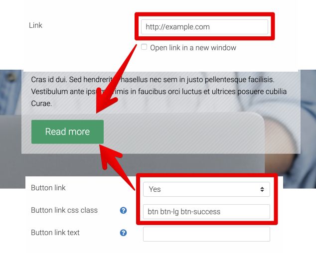
To set link for a slide type url in "Link" form field. If you want to show link button set "Button link" from field to "Yes" (if "No" whole slide will be a link). You may set your own button text in "Button link text" form field or leave it empty to use dafult text "Read more" text.
Use "Button link css class" form field to style slide button. By default slide button class is "btn btn-lg btn-primary", you may use: "btn-success", "btn-warning", "btn-info", "btn-danger", "btn-inverse".
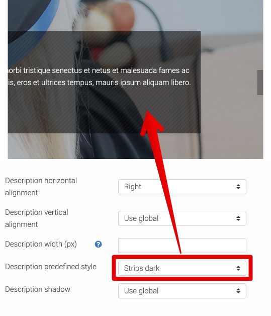
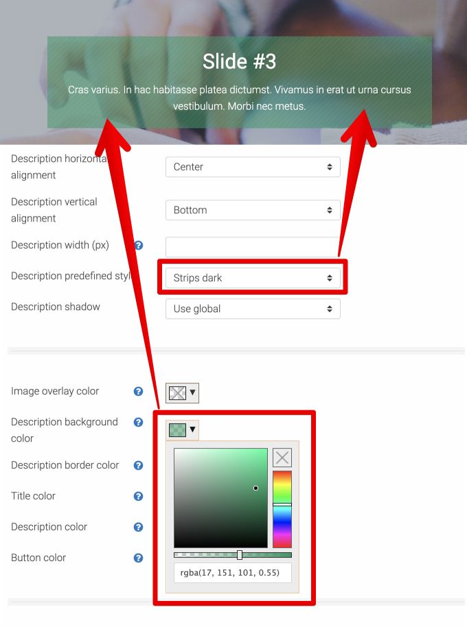
You may choose predefined slider description style, for example "Strip light" or "Strip dark" or set custom style.
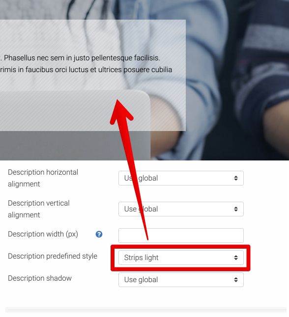
You may also mix predefined and custom styles, e.g. choose "Strip dark" style and set custom background color. See images below.
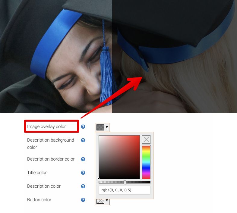
Sometimes you may want to make slide image darken or lighten. You may do it easy with "Image overlay color" option.
Front Page Builder
Installation
To use front page builder you need to install "Mb2 Page Builder" local plugin which is located in "Plugins" folder.
Go to Site administration → Plugins → Install Plugins, upload "local_mb2builder-x.x.x.zip" file and click "Install plugin from the ZIP file" button.
Import Demo Content
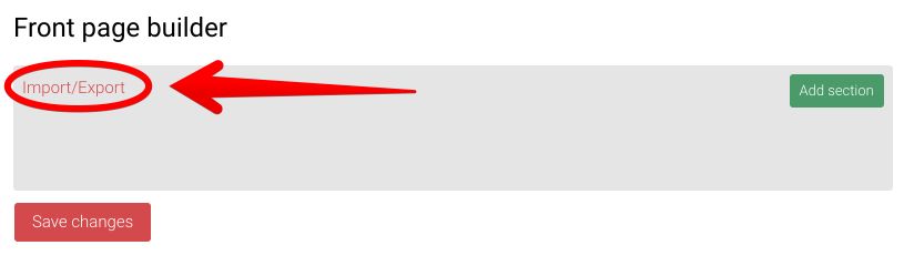
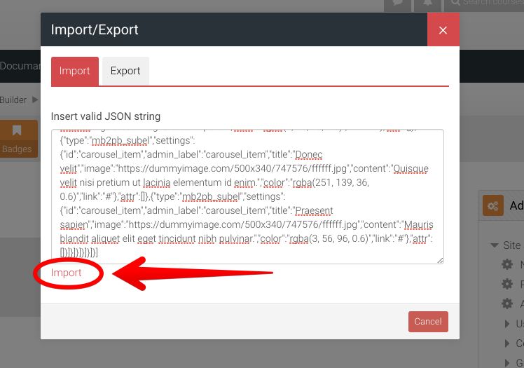
Go to Site administration → Mb2 builder → Front page builder and click "Import/Export" link.
Click button below to copy front page content code:
Then paste the code into import textarea and click "Import" link.
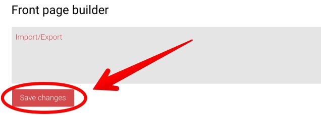
To keep changes click "Save changes" button.
Course Formats
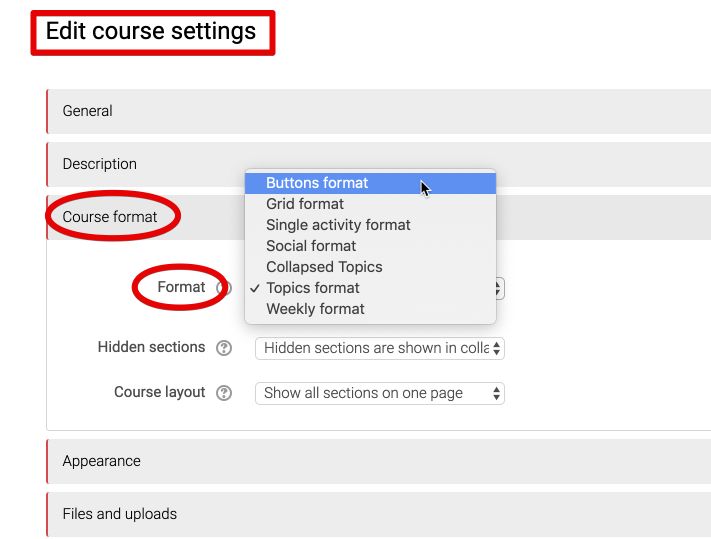
Buttons
To use "Buttons" course format dwonload and install this plugin: https://moodle.org/plugins/format_buttons.
Then on course settings page select "Buttons format" course format. For more info and documentation check this link: https://docs.moodle.org/36/en/Buttons_course_format
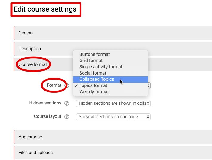
Collapsed Topics
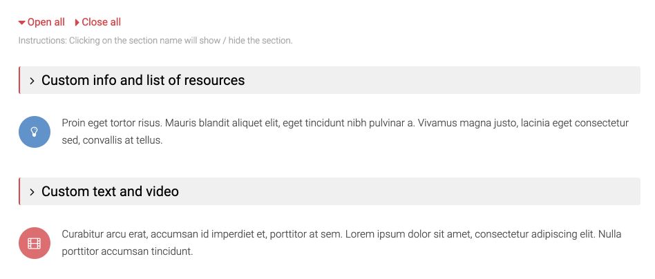
To use "Collapsed Topics" course format dwonload and install this plugin: https://moodle.org/plugins/format_topcoll.
Then on course settings page select "Collapsed Topics" course format. For more info and documentation check this link: https://docs.moodle.org/36/en/Collapsed_Topics_course_format
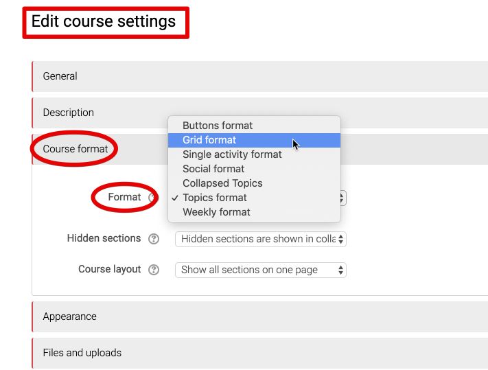
Grid
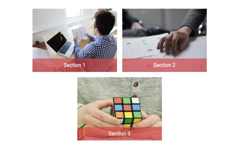
To use "Grid" course format dwonload and install this plugin: https://moodle.org/plugins/format_grid.
Then on course settings page select "Grid format" course format. For more info and documentation check this link: http://gjb2048.github.io/moodle-format_grid/
A-Z Courses Block
Installation
To use courses A-Z index you need to install "Mb2 A-Z Courses" block which is located in "Plugins" folder.
Go to Site administration → Plugins → Install Plugins, upload "block_mb2azcourses-x.x.x.zip" file and click "Install plugin from the ZIP file" button.
Display courses A-Z index
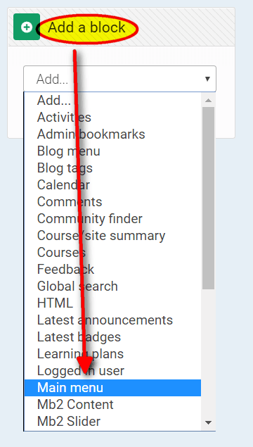
Go to front page, then Front page settings → Turn editing on and add "Main menu" block.
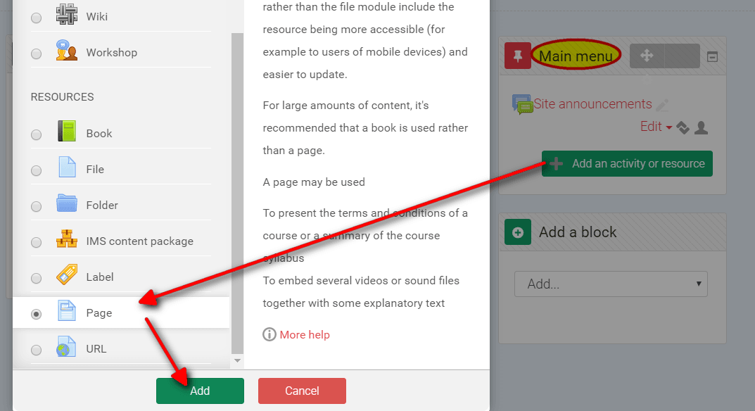
Then on Main menu block click "Add an activity or resource" button and add "Page" resource to the front page. You may call this page "Courses A-Z Index".
For more info check Moodle documentation.
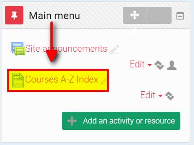
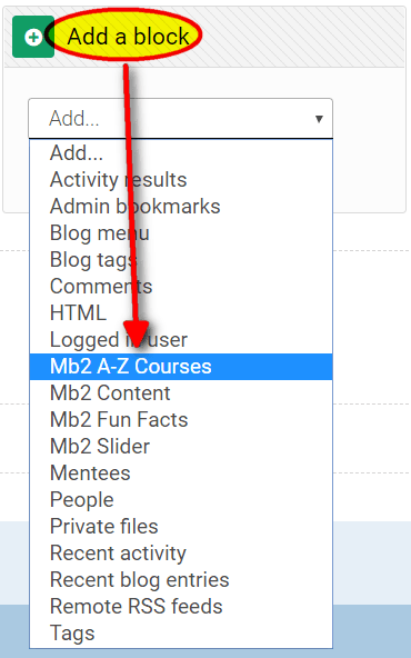
After that go to "Courses A-Z Index" page, find block "Add a block", choose from dropdown list "Mb2 A-Z Courses" block and move it to "Content Bottom" block region.
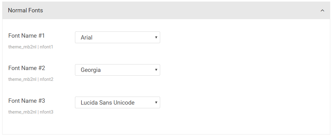
Font Settings
Fonts
Location: Theme settings → Fonts.
In "Fonts" settings you may set 3 normal fonts and 3 google web fonts which you may use then in "Typography" settings of the theme.
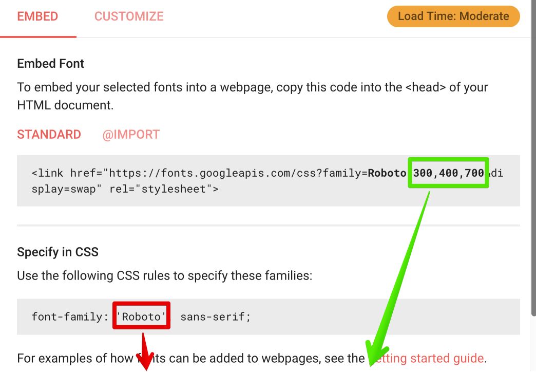
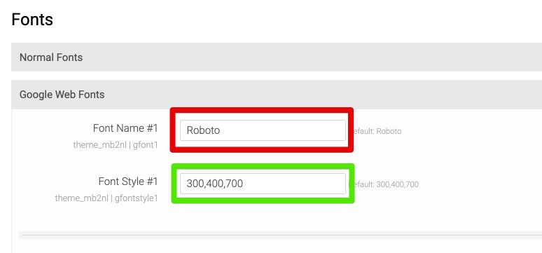
To add google webfont go to: https://fonts.google.com, find font which you want to use and copy name, style and subset (optional) attributes which you need to paste into specific form fields.
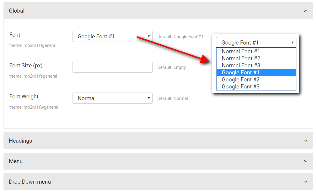
Typography
Location: Theme settings → Typography.
You may change typography settings for:
- Global fonts
- Headings fonts
- Menu fonts
- Dropdown menu fonts
For each group of typography you can select font:
- Normal Font #1
- Normal Font #2
- Normal Font #3
- ------------
- Google Font #1
- Google Font #2
- Google Font #3
These fonts you may set in "Fonts" settings.
Icon Fonts
In New Learning theme you may use over 1100 icons. The following icons ara available:
- Glyphicons - example name: "glyphicon-home"
- Font Awesome - example name: "fa-comments"
- Pe-icon-7-stroke - example name: "pe-7s-gym"
Style Settings
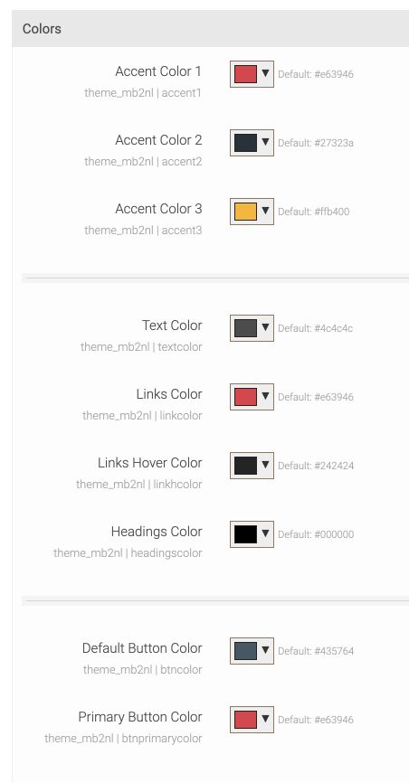
Colors
Location: Theme settings → Style → Colors.
In style settings you may set accent colors, text color, links (normal and hover) and headings colors. You may use normal (rgb) or transparent (rgba) colors.
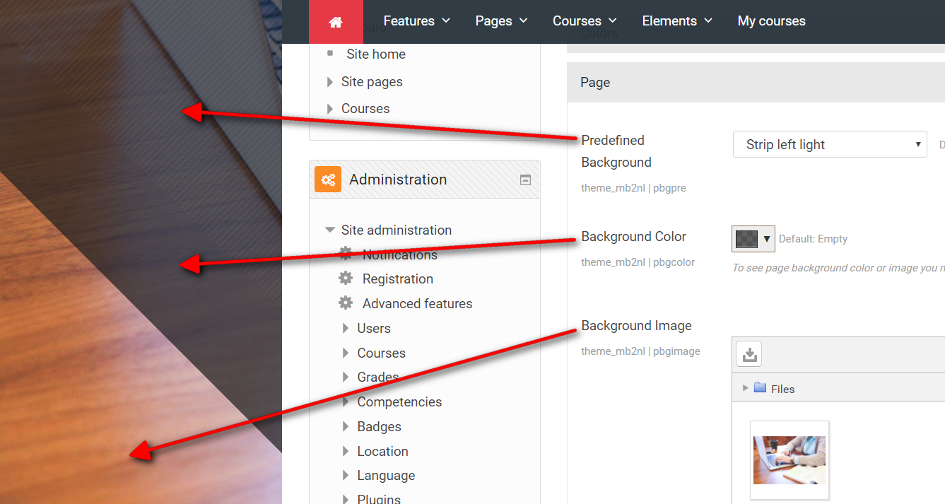
Page Style
Location: Theme settings → Style → Page.
You may set custom background of page and selected block regions (after slider, before content, after content) by adding:
- Background image
- Transparend color (to make lighten or darken background image)
- Predefined background effect (strips light or dark)
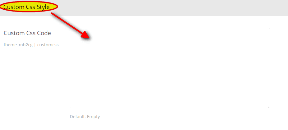
Custom Styles
Location: Theme settings → Style → Custom Css Style.
It is not recommended to change any theme file. It is safe but after upgrade to a newer version all changes will be lost.
If you want to add some small css changes you may use theme option "Custom Css Code".
Elements (shortcodes)
Shortcodes Filter
To use shortcodes you need to install "Mb2 Shortcodes" filter plugin which is located in "Plugins" folder.
Go to Site administration → Plugins → Install Plugins, upload "filter_mb2shortcodes-x.x.x.zip" file and click "Install plugin from the ZIP file" button.
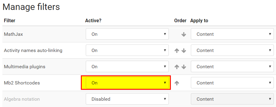
After installation you need to activate filter plugin. Go to Site administration → Plugins → Filters → Manage filters and activate "Mb2 Shortcodes" filter.
Shortcodes Button
To make easy use shortcodes you need to install "Mb2 Shortcodes Button" plugin which is located in "Plugins" folder.
Go to Site administration → Plugins → Install Plugins, upload "atto_mb2shortcodes-x.x.x.zip" file and click "Install plugin from the ZIP file" button.
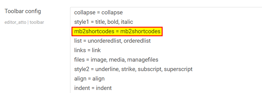
After installation go to Site administration → Plugins → Text editors → Atto HTML editor → Atto toolbar settings and add "mb2shortcodes = mb2shortcodes" text into "Toolbar config" form field and click "Save changes" button.
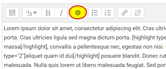
After that you may use shortcode generator by click "gear" icon in HTML editor toolbar.
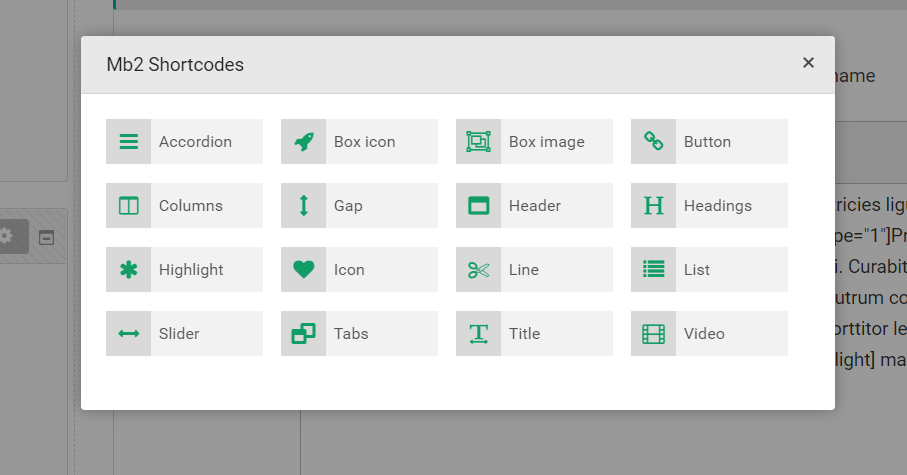
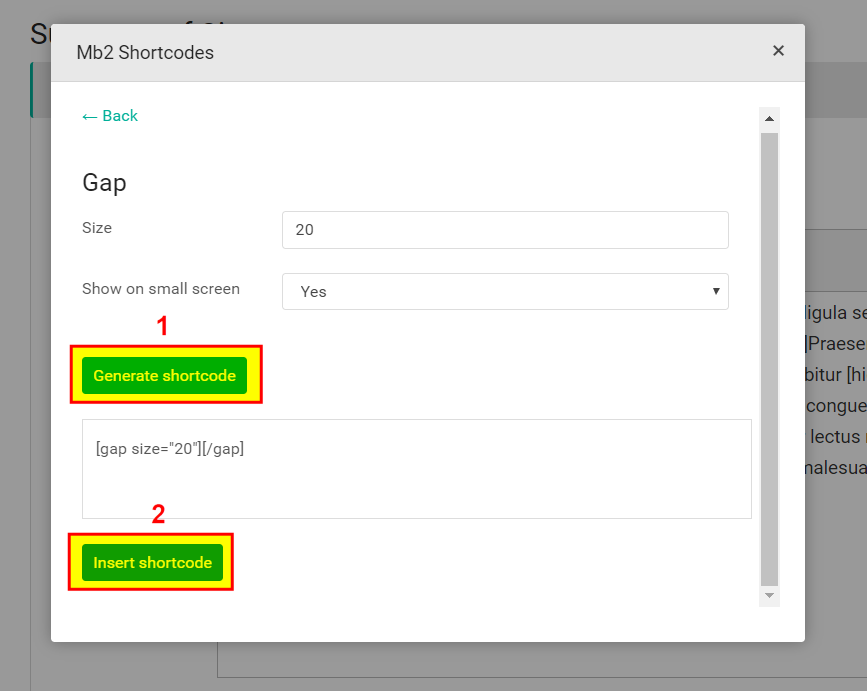
To use some shortcode set all options like you want, then click "Generate Shortcode" button and "Insert Shortcode" button.
Accordions
Return Bootstrap accordions.
[accordion parent="1"]
[accordion_item title="Title 1"]Content 1[/accordion_item]
[accordion_item title="Title 2"]Content 2[/accordion_item]
[/accordion]
| Attributes | Type | Default | Description |
|---|---|---|---|
| accordion | |||
| accordion_active | number | 1 | Set number of accordion which should be open. If you want close all accordions use "0". |
| parent | boolean | 1 | Set to "1" to close other items when one is opened. |
| accordion_item | |||
| title | string | Title here... | Title of the accordion item. |
| icon | string | Icon name: Glyphicons, Font Awesome or Pe-icon-7-stroke. | |
Box Content
Return boxes with custom text.
[boxes columns="3"]
[boxcontent color="primary" title="Box 1" icon="fa-star" link="#" linktext="Read more"]Content 1[/boxcontent]
[boxcontent color="warning" title="Box 2" icon="fa-star" link="#" linktext="Read more"]Content 2[/boxcontent]
[boxcontent color="success" title="Box 3" icon="fa-star" link="#" linktext="Read more"]Content 3[/boxcontent]
[/boxes]
| Attributes | Type | Default | Description |
|---|---|---|---|
| boxes | |||
| columns | number | 1 | Number of columns. |
| boxcontent | |||
| type | number | 1 | Box type: 1, 2, 3, 4 or 5. |
| color | string | primary | Box icon color: gray, primary, danger, info, inverse, success, warning . |
| title | string | Box title text. | |
| icon | string | Icon name: Glyphicons, Font Awesome or Pe-icon-7-stroke. | |
| link | url | Box link. | |
| linktext | string | Box link text. | |
| link_target | string | Box link target. Set "_blank" to open link in a new window. | |
Box Icon
Return boxes with text and animated icon.
[boxes columns="3"]
[boxicon icon="pe-7s-plugin" title="Title 1" link="#"]Content 1[/boxicon]
[boxicon icon="pe-7s-cloud-download" title="Title 2" link="#"]Content 2[/boxicon]
[boxicon icon="pe-7s-tools" title="Title 3" link="#"]Content 3[/boxicon]
[/boxes]
| Attributes | Type | Default | Description |
|---|---|---|---|
| boxes | |||
| columns | number | 1 | Number of columns. |
| boxicon | |||
| icon | string | Icon name: Glyphicons, Font Awesome or Pe-icon-7-stroke. | |
| type | number | 1 | Box type: 1, 2 or 3. |
| color | string | primary | Box icon color: gray, primary, danger, info, inverse, success, warning . |
| title | string | Box title text. | |
| link | url | Box link. | |
| link_target | string | Box link target. Set "_blank" to open link in a new window. | |
Box Image
Return boxes with image background.
[boxes columns="2"]
[boximg image="https://placeimg.com/750/445/nature" link="#" color="#e63946"]Text 1[/boximg]
[boximg image="https://placeimg.com/750/445/nature" link="#" color="#119d65"]Text 2[/boximg]
[boximg image="https://placeimg.com/750/445/nature" link="#" color="#fb8b24"]Text 3[/boximg]
[boximg image="https://placeimg.com/750/445/nature" link="#" color="#033860"]Text 4[/boximg]
[/boxes]
| Attributes | Type | Default | Description |
|---|---|---|---|
| boxes | |||
| columns | number | 1 | Number of columns. |
| size | string | Box size: "normal" or "small". | |
| boximg | |||
| image | url | Background image url. | |
| color | string | Hex (#000000) or rgb (rgb(0,0,0)) or rgba (rgba(0,0,0,.5)) color value. | |
| link | url | Box link. | |
| link_target | string | Box link target. Set "_blank" to open link in a new window. | |
Button
Return button.
[button link="#" type="primary" size="lg"]Read More[/button]
| Attributes | Type | Default | Description |
|---|---|---|---|
| type | string | default | Type of the button: "default", "primary", "success", "warning", "info", "inverse", "link". |
| size | string | Size class of the button: "lg", "sm", "xs". | |
| link | url | # | Button link. |
| target | string | Button link target attribute: "_blank", "_self". | |
| icon | string | Icon name: Glyphicons, Font Awesome or Pe-icon-7-stroke. | |
| icon_pos | string | before | Button icon position: "before" or "after'. |
| title | string | Button link title attribute. It's require for tooltip. | |
| ttpos | string | top | Tooltip position: "top', "right", "bottom", "left". |
| fw | boolean | 0 | Set to "1" for full width button. |
| border | boolean | 0 | Set to "1" for border button style. |
| class | string | Css class. | |
| margin | string | Margin (top right bottom left) in pixels, e.g. to set 10 pixels margin bottom use: "0 0 10px 0". |
Columns
Return Bootstrap columns.
[columns]
[column size="4"]Content 1[/column]
[column size="4"]Content 2[/column]
[column size="4"]Content 3[/column]
[/columns]
| Attributes | Type | Default | Description |
|---|---|---|---|
| size | number | 4 | The sum of all columns is 12. |
Gap
Return gap div.
[gap size="20"][/gap]
| Attributes | Type | Default | Description |
|---|---|---|---|
| size | number | 20 | Gap size in pixels. |
| smallscreen | boolean | 1 | Set to "0" if you want to disable gap in small screen devices (tablet or smartphone). |
Header
Return div with image background.
[header type="dark" title="Title" subtitle="Subtitle" image="https://placeimg.com/950/250/nature"][/header]
| Attributes | Type | Default | Description |
|---|---|---|---|
| type | string | dark | Header type: "dark", "dark_striped", "light", "light_striped". |
| title | string | Title text. | |
| subtitle | string | Subtitle text. | |
| image | url | Background image url. | |
| margin | string | Margin (top right bottom left) in pixels, e.g. to set 10 pixels margin bottom use: "0 0 10px 0". |
Headings
Return heading tag.
[h size="1"]Heading text[/h]
| Attributes | Type | Default | Description |
|---|---|---|---|
| size | number | 4 | Heading hierarchy, from 1 to 6 |
| margin | string | Margin (top right bottom left) in pixels, e.g. to set 10 pixels margin bottom use: "0 0 10px 0". |
Highlight
Return string in highlight span tag.
[highlight type="1"]Text[/highlight]
| Attributes | Type | Default | Description |
|---|---|---|---|
| type | number | 1 | Highlight type (style): 1, 2 or 3 |
Icon
Return icon font.
[icon name="fa-star"]Optional text[/icon]
| Attributes | Type | Default | Description |
|---|---|---|---|
| name | string | fa-star | Icon name: Glyphicons, Font Awesome or Pe-icon-7-stroke. |
| color | string | Hex (#000000) or rgb (rgb(0,0,0)) or rgba (rgba(0,0,0,.5)) color value. | |
| size | string | default | Icons size class: "small", "default", "large", "xlarge". |
| spin | boolean | 0 | Set to "1" to spin icon. It works width Font Awesome and Pe-icon-7-stroke icons. |
| rotate | string | normal | Rotate class: "normal", "rotate-90", "rotate-180", "rotate-270", "flip-horizontal", "flip-vertical". |
| margin | string | Margin (top right bottom left) in pixels, e.g. to set 10 pixels margin bottom use: "0 0 10px 0". | |
| sizebg | number | Icon background size in pixels. | |
| rounded | boolean | 1 | Set to "0" to get square background icon. |
| bgcolor | string | Hex (#000000) or rgb (rgb(0,0,0)) or rgba (rgba(0,0,0,.5)) color value. | |
| icon_text_pos | string | after | Icon text position: "before", "after". |
| nline | boolean | 0 | Set to "1" if you want place icon in a new line. |
Image
Return image.
[image]https://placeimg.com/300/300/nature[/image]
| Attributes | Type | Default | Description |
|---|---|---|---|
| alt | string | Alternative text. | |
| align | string | Image align: "left", "right", "center". | |
| link | url | Image link. | |
| link_target | string | Image link target. Set "_blank" to open link in a new window. | |
| width | number | Image width. Height will be set automatically. | |
| margin | string | Margin (top right bottom left) in pixels, e.g. to set 10 pixels margin bottom use: "0 0 10px 0". |
Line
Return horizontal line.
[line][/line]
| Attributes | Type | Default | Description |
|---|---|---|---|
| color | string | dark | Line color: "dark", "light". |
| custom_color | string | Hex (#000000) or rgb (rgb(0,0,0)) or rgba (rgba(0,0,0,.5)) color value. | |
| style | string | solid | Border style: "solid", "dotted", "dashed". |
| double | boolean | 0 | Use "1" to set double line. |
| size | number | 1 | Border width in pixels. |
| margin | string | Margin (top right bottom left) in pixels, e.g. to set 10 pixels margin bottom use: "0 0 10px 0". |
List
Return list.
[list]
[list_item icon="fa-flag" link="#"]List 1[/list_item]
[list_item icon="fa-trophy" link="#"]List 2[/list_item]
[list_item icon="fa-crosshairs" link="#"]List 3[/list_item]
[/list]
| Attributes | Type | Default | Description |
|---|---|---|---|
| list | |||
| type | number | 1 | List type: 1, 2 or 3 |
| horizontal | boolean | 0 | Set to "1" to display list items horizontally. |
| align | string | List items alignment: "left", "right", "center". | |
| margin | number | Margin (top right bottom left) in pixels, e.g. to set 10 pixels margin bottom use: "0 0 10px 0". | |
| list_item | |||
| icon | string | Icon name: Glyphicons, Font Awesome or Pe-icon-7-stroke. | |
| link | url | List item link. | |
| link_target | string | List item target. Set "_blank" to open link in a new window. | |
Slider
Return slider carousel.
[slider]
[slider_item image="https://placeimg.com/1200/600/nature"][/slider_item]
[slider_item image="https://placeimg.com/1200/600/nature"][/slider_item]
[slider_item image="https://placeimg.com/1200/600/nature"][/slider_item]
[/slider]
| Attributes | Type | Default | Description |
|---|---|---|---|
| slider | |||
| columns | number | 1 | Number of visible images. |
| gutter | number | 0 | Slide horizontal margin in pixels. |
| autoplay | boolean | 1 | Auto animation. |
| loop | boolean | 1 | Loop animation. |
| animtime | number | 450 | Animation time in miliseconds. |
| pausetime | number | 5000 | Pause time in miliseconds. |
| nav | boolean | 1 | Prev/next navigation. |
| dots | boolean | 1 | Dots navigation below slider. |
| margin | number | Margin (top right bottom left) in pixels, e.g. to set 10 pixels margin bottom use: "0 0 10px 0". | |
| slider_item | |||
| image | url | Image url. | |
| title | string | Caption title. | |
| desc | string | Caption description. | |
| link | url | Slider item link. | |
| target | string | List item target. Set "_blank" to open link in a new window. | |
Tabs
Return Bootstrap tabs.
[tabs]
[tab_item title="Tab 1" icon="fa-trash-o"]Content 1[/tab_item]
[tab_item title="Title 2" icon="fa-shopping-cart"]Content 2[/tab_item]
[tab_item title="Title 3" icon="fa-calendar"]Content 3[/tab_item]
[/tabs]
| Attributes | Type | Default | Description |
|---|---|---|---|
| tabs | |||
| tabpos | string | top | Tabs position: "top", "left", "right". |
| height | number | Min height in pixels. It's reguired for "left" or "right" tabs position. | |
| margin | string | Margin (top right bottom left) in pixels, e.g. to set 10 pixels margin bottom use: "0 0 10px 0". | |
| tab_item | |||
| title | string | Title | Tab title text. |
| icon | string | Icon name: Glyphicons, Font Awesome or Pe-icon-7-stroke. | |
Title
Return title.
[title subtext="Subtext"]Title text[/title]
| Attributes | Type | Default | Description |
|---|---|---|---|
| subtext | string | Subtitle text. | |
| size | string | Set to "s" if you want small title. | |
| align | string | left | Title alignment: "left", "right", "center". |
| tag | string | h4 | HTML tag for title. |
| margin | string | Margin (top right bottom left) in pixels, e.g. to set 10 pixels margin bottom use: "0 0 10px 0". |
Video
Return web video (Youtube or Vimeo) iframe.
[video id="wop3FMhoLGs"][/video]
| Attributes | Type | Default | Description |
|---|---|---|---|
| id | string | Youtube, Vimeo, Aparat video url or id. | |
| bg_image | url | Optional background image url. | |
| ratio | string | "16:9", "4:3" | |
| margin | string | Margin (top right bottom left) in pixels, e.g. to set 10 pixels margin bottom use: "0 0 10px 0". |
Support
Before Send a Support Message
To solve problem faster add to the support message several informations:
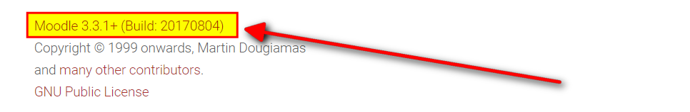
1. Moodle version. To find which Moodle version you are using go to: Site administration → Notifications.
2. Server Info (PHP version, server system and version, MySQL version). To find server info go to: Site administration → Server → PHP info
3. Error message. To know if Moodle returns some errors. Go to: Site administration → Development → Debugging and set "Debug messages" option to "DEVELOPER: extra Moodle debug messages for developers".
4. Screenshots or video. Create screenshot or record video to illustrate a problem.
Send a Support Message
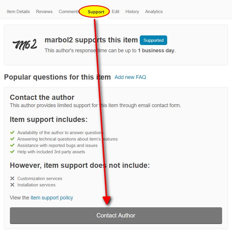
To get support visit item page on Themeforest then click "Support" tab and send me a message.
Response time can be up to 1 business day.
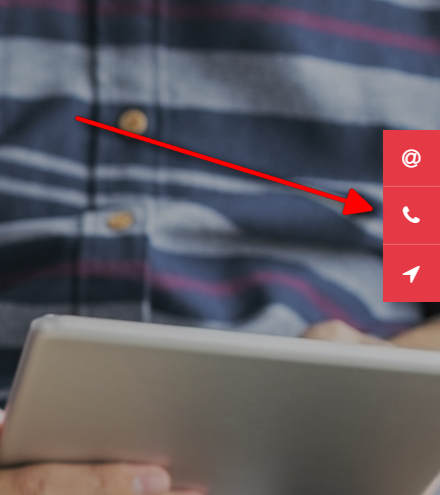
Social Icons
You may show social network icons in header and footer.
To add social icon just select it from list.